
/ Slicktify
A dashboard can look polished and still leave an operator chasing answers through spreadsheets, inboxes, and separate systems. That is the central test in property dashboard reviews: not whether the screen has attractive charts, but whether it gives you a dependable view of what needs attention across properties, assets, teams, and business units.
For a single rental, the difference may be knowing a work order is overdue before a tenant calls again. For a multi-location hospitality, restaurant, or commercial portfolio, it may mean seeing occupancy changes, revenue pressure, maintenance risks, and unresolved exceptions in one operating view. The right dashboard reduces status chasing. The wrong one simply adds another place to check.
What Property Dashboard Reviews Should Actually Assess
A useful review starts with the operating problem, not a feature checklist. Ask what information you currently have to assemble manually every week or month. If someone must export reports, reconcile conflicting numbers, ask managers for updates, and build an executive summary from scratch, the dashboard has a clear job to do.
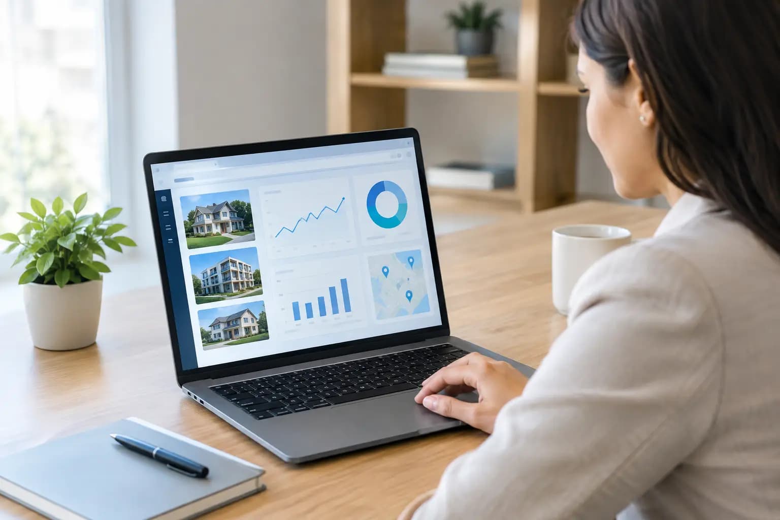
The strongest platforms make portfolio conditions visible without forcing users to hunt through modules. They should bring together the signals that drive action: property status, occupancy, revenue, open work, upcoming obligations, alerts, and exceptions. A dashboard that reports activity without showing priority is less useful than it appears.
Look closely at whether the system can answer practical questions quickly. Which locations have the most overdue work? Where is occupancy trending down? Which assets are approaching a deadline or creating repeat maintenance costs? Which managers need follow-up? If the answer still requires downloading data and rebuilding it elsewhere, centralization is incomplete.
Reviews should also distinguish between a property-management screen and a true operational command center. Some tools work well for a narrow workflow, such as rent collection or lease administration, but do not provide a shared view across mixed property types, physical assets, operational tasks, and leadership reporting. Neither approach is automatically wrong. It depends on the complexity of the portfolio and the decisions the team must make.
Visibility Is More Valuable Than More Data
Most operators do not have a data shortage. They have disconnected data, delayed data, and data with no clear owner. A dashboard should create structure around information that already exists, while making gaps and exceptions hard to miss.
That means the best screens do not try to display every available metric at once. They establish hierarchy. Critical exceptions should rise to the top. Portfolio-level indicators should show the overall condition of the business. Users should be able to move from a high-level signal into the affected property, asset, task, or record without losing context.
Consider an owner who oversees several properties and receives updates from different managers. A basic dashboard may show the number of open work orders. A more useful one identifies the aging work orders, the properties with repeated issues, the responsible parties, and the business impact. The first provides a count. The second supports a decision.
This is where many property dashboard reviews become too shallow. They describe available widgets but do not evaluate whether those widgets help the user prioritize. For operators, visibility only matters when it shortens the time between noticing a problem and assigning the next action.
Check whether the dashboard works by role
A single dashboard does not need to look identical for everyone. Executives need portfolio health, trend direction, financial and operational exceptions, and confidence that issues have owners. Property managers need immediate work queues, occupancy signals, unresolved tasks, and alerts tied to their locations. Field teams need clear assignments and status updates.
The key is that these views should come from the same system of record. If each role operates from a separate spreadsheet or reporting process, the business eventually ends up debating whose numbers are current. Shared data creates cleaner handoffs and stronger accountability.
Evaluate the Quality of Exception Management
Normal operations rarely create the greatest risk. Exceptions do: a task that has sat untouched for two weeks, a location missing required documentation, an unexpected revenue change, a vacancy that is aging, or an asset that needs attention before it becomes a larger expense.
When evaluating a dashboard, examine how it handles these conditions. Can users define alerts around deadlines, thresholds, and overdue items? Can managers see what requires action without sorting through routine activity? Can the team assign ownership and track resolution?
A platform that surfaces problems but does not support follow-through creates awareness without control. The dashboard should connect insight to execution. A user should be able to identify an exception, understand its context, assign or update the work, and confirm it has been resolved.
This matters even more as portfolios grow. In a small operation, a manager may remember the status of every property. At scale, memory becomes an operating risk. A disciplined exception view replaces informal follow-up with visible accountability.
Test Reporting Beyond the Demo Screen
A dashboard demo often shows clean sample data. Real portfolios are messier. Before making a decision, ask how the system behaves when properties have different operating models, teams use different terms, or records are incomplete. Reporting should bring order to that complexity rather than conceal it.
Review the reporting process in practical terms. Can you produce a leadership-ready view without rebuilding it in a spreadsheet? Can reports cover multiple properties, regions, brands, or business units? Can users filter information without creating a confusing maze of saved versions? Can the same metric be traced back to the underlying record?
Data traceability is especially important for owners and investment teams. A dashboard may indicate that maintenance costs increased or occupancy fell, but decision-makers need enough context to understand why. They should be able to move from a portfolio metric to the relevant locations, dates, assets, or work items.
The goal is not to eliminate every report. It is to eliminate repetitive report assembly. When reporting is centralized, teams spend less time collecting updates and more time addressing what the updates reveal.
Watch for spreadsheet dependency
Spreadsheets remain useful for analysis, modeling, and one-off planning. They become a problem when they are the only place where the portfolio can be understood. If a dashboard requires constant manual imports, exports, and side calculations to stay current, it may not be delivering the operating structure your team needs.
Ask what data can be maintained directly in the platform and how consistently it remains available across the organization. The answer will affect adoption. Teams are more likely to update records when those records immediately support their work, instead of disappearing into a report no one sees until month-end.
Consider Scale Without Buying More Than You Need
The best choice for one owner with a few units may differ from the best choice for a multi-state enterprise with properties, equipment, facilities tasks, and several layers of management. A highly specialized tool can be appropriate for a focused workflow. A broader operating platform becomes more valuable when information must be connected across asset types and locations.
Property dashboard reviews should therefore examine flexibility. Can the system support a growing number of properties and users? Can it accommodate different asset categories and operational processes? Can leaders maintain portfolio-level oversight while local teams work from the details that matter to them?
At the same time, avoid buying complexity for its own sake. A platform that needs extensive customization before it provides basic visibility may slow down adoption. Look for a structure that is clear enough to get started quickly, while still supporting the governance required as the organization expands.
Slicktify is designed for this middle ground: one intelligent command center for properties, assets, occupancy, revenue, work orders, alerts, and operational exceptions. The value is not another isolated portal. It is a cleaner operating layer that lets teams see portfolio health and act without a spreadsheet maze.
Questions to Ask Before You Commit
Before relying on ratings alone, use your own operating scenarios. Ask a vendor to show how the dashboard handles an overdue critical task, a sudden occupancy issue, a property with recurring maintenance concerns, and an executive request for a portfolio update. These are more revealing than a generic feature tour.
Also ask who will own data quality, how teams will update records, and what happens when a process changes. Technology can improve discipline, but it cannot replace clear responsibilities. The most effective dashboard is one that fits the way your organization makes decisions while making weak handoffs and hidden issues visible.
A good dashboard should make the next action obvious. When your team can see the condition of the portfolio, understand what is off track, and assign responsibility without assembling a separate report, it has become more than a reporting screen. It has become part of the operating system.